Maps with {edgebundle}
Mapping US flight networks
Goal
Use {edgebundle} to map flight patterns over the US.
# remotes::install_github("schochastics/edgebundle")
library(edgebundle)
library(igraph)
library(ggplot2)
library(ggraph)
library(dplyr)
library(sf)
library(tigris)

set.seed(24601)

my_caption <- c("Liz Roten (@LizRoten) | Data: openflights.org")
We also need to use the Python library, datashader. {edgebundle} ships with a nice function for installing all the dependencies.
edgebundle:::install_bundle_py()
Data prep
The data we will use is us_flights, which is shipped with {edgebundle}. us_flights is a complex object.
flights <- us_flights # name us_flights
coords <- cbind(V(flights)$longitude, V(flights)$latitude) # extract coordinates

# create vertex sequence
verts <- data.frame(x = V(flights)$longitude, y = V(flights)$latitude)
Supporting data
To make our output a little more aesthetically pleasing, we will go ahead and transform the data to use Albers Equal Area Conic.
states <- tigris::states(cb = TRUE, progress_bar = FALSE) %>%
  filter(STUSPS %in% state.abb,
         !NAME %in% c("Alaska",
                      "Hawaii")) %>%
  sf::st_transform(crs = " +proj=aea +lat_1=20 +lat_2=60 +lat_0=40 +lon_0=-96 +x_0=0 +y_0=0 +ellps=GRS80 +datum=NAD83 +units=m no_defs")
coords_full <- cbind(V(flights)$longitude, V(flights)$latitude,  V(flights)$name) # extract coordinates


coords_sf <- st_as_sf(x = as.data.frame(coords_full), coords = c("V1", "V2"), crs = 4326) %>%
  sf::st_transform(crs = " +proj=aea +lat_1=20 +lat_2=60 +lat_0=40 +lon_0=-96 +x_0=0 +y_0=0 +ellps=GRS80 +datum=NAD83 +units=m no_defs")
Edge bundle
Create edge bundles
force_bundle <- edge_bundle_force(flights, xy = coords, compatibility_threshold = 0.6)

force_bundle_sf <- force_bundle %>%
  st_as_sf(coords = c("x", "y"), crs = 4326) %>%
  sf::st_transform(crs = " +proj=aea +lat_1=20 +lat_2=60 +lat_0=40 +lon_0=-96 +x_0=0 +y_0=0 +ellps=GRS80 +datum=NAD83 +units=m no_defs") %>%
  rowwise() %>%
  mutate(x_coord = st_coordinates(geometry)[[1]],
         y_coord = st_coordinates(geometry)[[2]])
Create map
source("theme.R")
base_plot <- geom_sf(data = states,
          color = "white",
          fill = NA,
          lwd = 0.1)
final_map <- ggplot() +
base_plot +
geom_path(data = force_bundle_sf,
aes(x = x_coord,
y = y_coord,
group = group),
color = line_color,
size = 0.5,
alpha = 0.2) +
geom_path(data = force_bundle_sf,
aes(x = x_coord,
y = y_coord,
group = group),
color = "white",
size = 0.005,
alpha = 0.1) +
geom_sf(data = coords_sf,
color = line_color,
size = 0.25) +
geom_sf(data = coords_sf,
color = "white",
size = 0.25,
alpha = 0.1) +
labs(title = "US Flight Network",
# subtitle = "Force Bundle Method",
caption = my_caption) +
my_theme
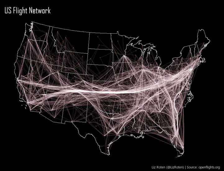
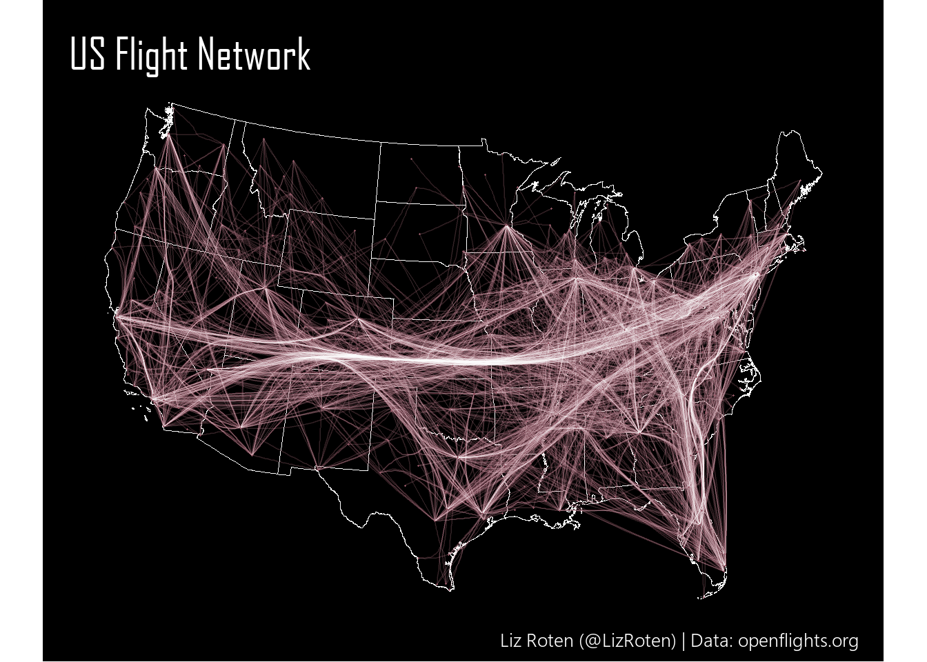
final_map
To get the sizing just right on the final image I posted on Twitter, I adjusted the size of my viewing panel in RStudio until I was happy with the dimensions.
Credits
This entire post was inspired by Dominic Royé.
Trying a very nice new tool, thanks to {edgebundle} package created by @schochastics. Here the European flight network in a bundle flow version. #rstats #rspatial #datavis pic.twitter.com/dty4tTSYdE
— Dr. Dominic Royé (@dr_xeo) December 19, 2020
You can find my tweet with this map here.